Fashion promotion / Photography workshop.
- Freddie Masterson

- Nov 26, 2020
- 3 min read
Updated: Nov 27, 2020
Before we started the fashion and photography workshop I was a little concerned that I wouldn't find the workshop helpful or inspiring due to use working with fashion, however I quickly learnt that this workshop would still be a highly valuable lesson in which we could freely experiment with lighting and colour.
There wasn't much time for my group to experiment as the entire class has to take turns using the modelling area. While others posed and took their photographs we were taught about projecting images onto your subject while maintaining a dark background, as how that can be achieved by projecting from a side angle as to not light the background. We also learnt that it was possible to cover the sides of the light to limit the amount of light that spreads to the dark areas.
I wasn't a massive fan of using projected images however the use of side lighting or one point lighting really inspired me. There wasn't enough time to research any artists who had used this technique themselves so I just had to experiment and follow and ideas I was inspired by.
I took a series of images using Dan as my subject. I wanted to create a tense image using harsh lighting that would create a strong contrast between the shadows and the highlights. I wanted to make the background as dark as I could, so I used side lighting within all of my photographs as well as having all of the room lights turned off and the door closed. After taking my images I moved onto a digital workflow in which I began editing my images within photoshop. I produced these results (original photo on the left and edited result on the right):
The first image I edited, involved some very simple changes that included painting on additional shadow layers with varying values of opacity so that the edges of the shadows were smooth.
The second image I manipulated in photoshop had its vibrance decreased and its saturation, contrast and brightness increased. Once again I used additional layers to create more detailed and specific shadows.
The final image used the same filters and processes as the first two images, however this time the actual source of the light was visible in frame as I personally really liked the aesthetic that the LED light strips provided in the photo.
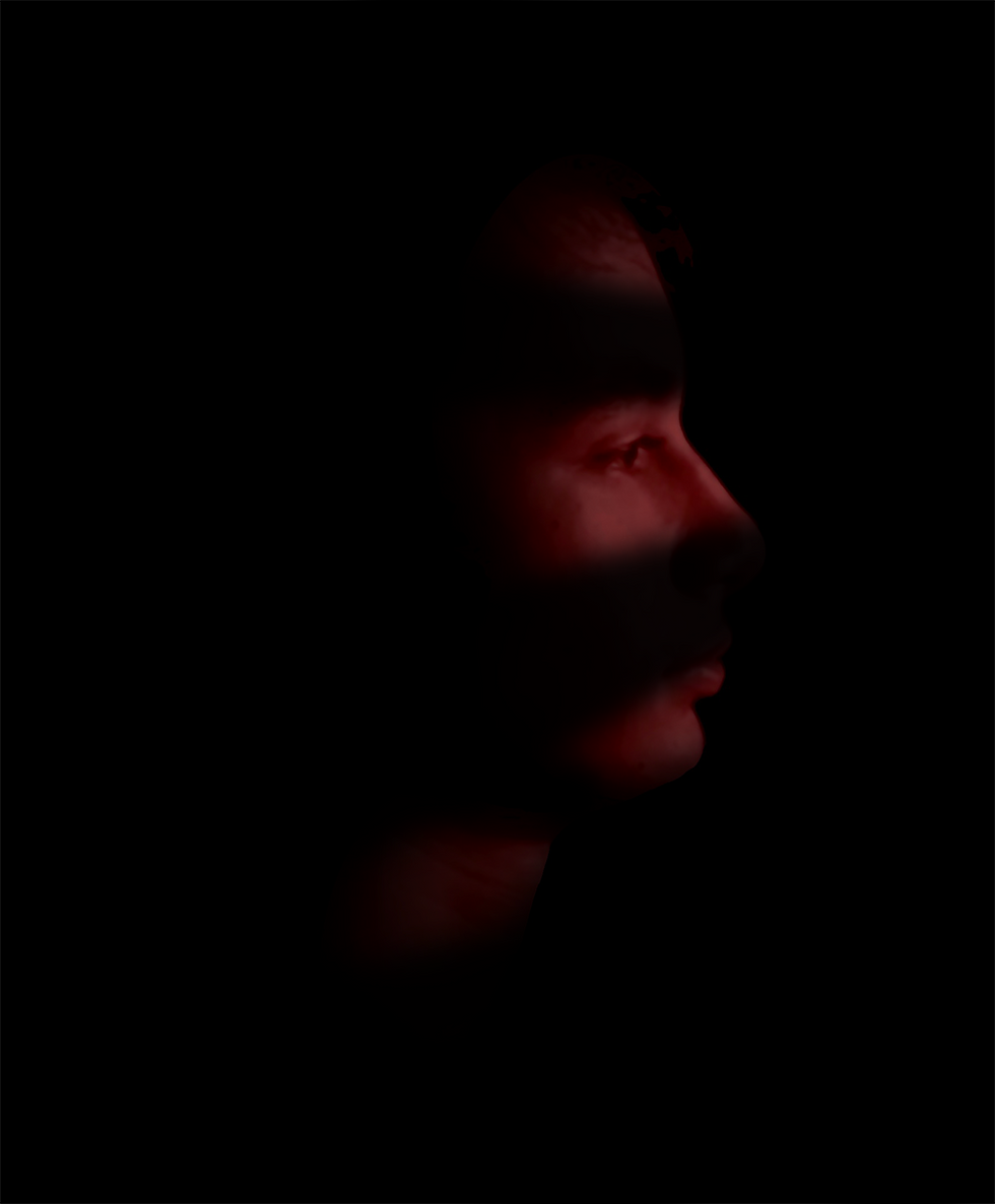
This workshop helped me produce some really creative images that I was very pleased with. Overall the first image has a result that I am the most proud of. I spoke to Joel about this image and we came to discuss about how the image reminded us of scenes from classic horror movies in which someone is hiding or watching through cracks with some light illuminating their eyes.
I took this image back into photoshop to remove some of the illuminating Dan's face to replicate this concept of light coming in through the cracks. I ended up creating blocks of black and transforming the layer with perspective, then I used a Gaussian Blur filter to blend the new shadows. Then I finally changed the blending mode to 'Darken' as well as decreasing the opacity of the layer to 80%.

I am not entirely sure that the effect worked out as it is kind of unclear why there are lines of shadows across the face, however if there was context that explained where this character was then the shadows would make sense to the viewer. Overall this workshop ended up being a lot of fun and allowed us all to produce some work and concepts that we were all proud of.


Comments